Lightbox Pro with image gallery support Magento extension
CONTENTS
3. General configurable options
Description
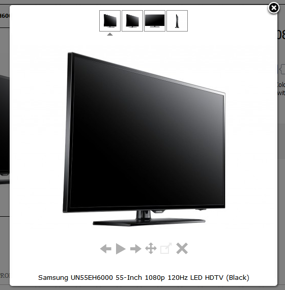
Lightbox Pro is a good lightbox extension, that allows you to replace default magento image zoom with new easy-to-use and flexible Lightbox module. With Lightbox Pro extension you can place single images, text boxes and even complete image galleries at your CMS pages without any need to edit your store code. Our extension will make your products more attractive for customers and of course will encourage your customers to purchase.So, Lightbox Pro will help you:
- Improve the appearance of your products images.
- Change the options for content, style and behaviour to make your lightbox images look exactly like you wish.
- Place products galleries with magento widget.
- Place text or any other content into lightbox window.
Installation
Thank you for downloading our magento extension. Please follow these instructions to proceed with the installation of your theme:Turn store compilation off
Navigate to Admin -> Tools -> Compilation and deactivate compilation mode for your store.Copy all files into your magento directory
Simply copy all files from "extension source x.x.x" directory into your magento store directory.In case you have different then "default" default folder - rename folders app/design/frontend/default/default and skin/frontend/default/default.Turn your magento cache off
Navigate to Admin -> System -> Manage Cache and deactivate cache for your store.Refresh your admin user access rights
Simply logout from your store admin and then login back.General configurable options
Lightbox Pro extension configuration is based on Highslide JavaScript library settings.To customize the main configurable options, please go to Admin>System>Configuration>Lightbox Pro. If you need more detailed information, you can also follow the link http://highslide.com/ .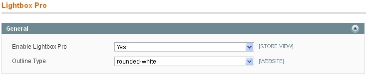
- Enable Lightbox Pro - please select Yes to enable Lightbox Pro extension.
- Outline Type - select the pre-configured type for image.
Image size tab
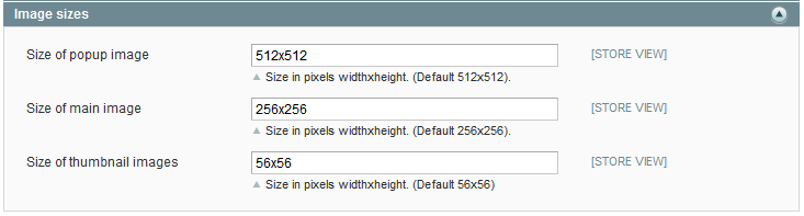
- Size of popup image - please specify the size in pixels for lightbox image.
- Size of main image - specify the size in pixels for the main image.
- Size of thumbnails images - specify the size in pixels for thumbnails images.
Gallery tab
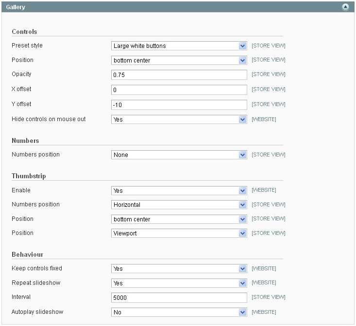
Controller options settings allow you to configure the built control keyboard for better navigation the image.
- Preset style - select the preset style for controls on the image.
- Position - select the positions for controls.
- Opacity - specify the opacity for controls.
- X offset - specify the X offset for the controls.
- Y offset - specify the Y offset for the controls.
- Hide controls on mouse out - select Yes if you need to hide controls before you drag your mouse over the image.
Numbers setting allows you to place the image pages numbers according to your needs.
- Numbers position - select the number position for image pages. Possible values are None, Heading and Caption.
Thumbstrip settings will help you to configure the sketches of possible lightbox images.
- Enable - select Yes to enable thumbstrip.
- Numbers position - select the display mode of thumbstrip. Possible values are Horizontal, Vertical and Float.
- Position - select the display position of thumbstrip.
- Position - select the display position of thumbstrip on the image or on the viewport.
Behaviour settings allow you to adjust the image position.
- Keep controls fixed - select Yes if you want to align subsequent slides so that the controls are in the same position for the next image. This means the user can browse through the images using the "Next" button without moving the mouse.
- Repeat slideshow - select Yes to repeat slideshow.
- Interval - specify the interval for slideshow.
- Autoplay slideshow - if you select Yes, the slideshow starts without clicking on controls.
Inner HTML Widget tab
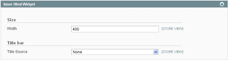
- Width - specify the width of the HTML popup.
- Title source - select the source to pull the title of. Possible values are None, A given string, Anchor’s title attribute and Anchor’s inner HTML.
Style tab
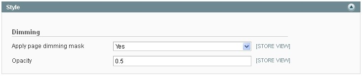
- Apply page dimming mask - select Yes to add a translucent mask above the page behind the lightbox image.
- Opacity - specify the opacity for dimming mask.
Behaviour tab
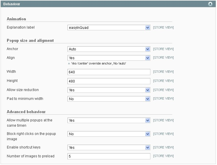
Animation setting allows you to override the animation style for the lightbox window.
- Explanation label - select the animation style that is based on commonly used set of equations originally authored by Robert Penner.
Popup size and alignment settings allow you to configure the flexible position of lightbox image display. You can set the popup size and reduce the image to fit the viewport.
- Anchor - select the alignment of the lightbox image in the viewport.
- Align - if you select Yes, the anchor will be overridden in the center. If you select No, the anchor will be overridden automatically.
- Width - specify the lightbox image content width.
- Height - specify the lightbox image content height.
- Allow size reduction - select Yes to allow the image to shrink to install a small viewport. If the viewport is small, the expanded pictures by default shrink to fit the area.
- Pad to minimum width - select Yes to enable the pad for the caption on narrow images.
Advanced behaviour settings will help you to speed up viewing multiple images at once and to prevent unnecessary user behavior for you with lightbox images.
- Allow to multiple popups at the same time - select Yes to allow multiple popups to be open at the same time.
- Block right clicks on the popup image - select Yes to block the right clicks and context menu on the lightbox image.
- Enable shortcut keys - select Yes to enable the shortcuts keys.
- Number of images to preload - specify the number of images to be preloaded on the page by default.
Overlays tab
Caption
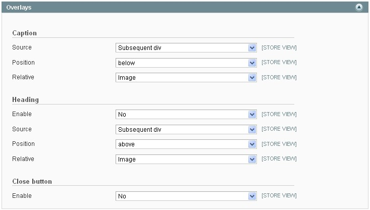
- Source - please select the source where to get the caption text in the HTML code.
- Position - select the caption position.
- Relative - select the position of the caption relative to the image or the viewport.
Heading
- Enable - select Yes to enable the heading.
- Source - please select the source where to get the caption text in the HTML code.
- Position - select the heading position.
- Relative - select the position of the heading relative to the image or the viewport.
Close button
- Enable - select Yes to overlay a close button.
Use cases
Creating AJAX based lightbox window with html content based on content of CMS page
Please go to Admin>CMS and follow next steps:- At CMS pages please create new CMS page with content you want to show in lightbox window.
- In the Content field specify the text and click on Save block.
- In the Design settings please set Layout * to ”empty” so that page will output only content without store layout.
- Now you are ready to create ajax based lightbox with next code:
<a href="{{store url="YOURCMSCONTENTPAGEURL"}}" onclick="return hs.htmlExpand(this, { objectType: 'ajax'})" class="highslide">Ajax Modal Window </a>. Please notice that you should change YOURCMSCONTENTPAGEURL to URL of page you have created in #1.</li> - Click on Save Page
Creating image gallery using Lightbox Pro widget
 Please go to Admin>CMS>Pages and follow next steps:
- Open the page where you want to place the gallery.
- At Page information tab in the Content field please press Insert Widget button.
- At Widget type select Lightbox Pro Gallery.
- At Widget options tab browse the gallery images.Click on Insert Widget at upper right corner of the page.
- Click on Save Page.
Placing lightbox widget into categories description
Please go to Admin>CMS and follow next steps:- At Static blocks add new one.
- At Block information tab press Insert Widget button in the Content field. and click on Save block.
- Select Lightbox Pro Image widget type and fill the appropriate fields.
- Click on Save Block.
- Then go to System>Catalog>Manage Categories and select Display settings tab.
- In the CMS block field select the block, that you created before and click on Save category.
Placing youtube video in lightbox window on the cms page
Please go to Admin>CMS>Pages and follow next steps:- Select the page to edit.
- At Page information tab press Insert Widget button in the Content field.
- Select LightboxPro Inner HTML widget type.
- Fill the fields according to your needs.
Support
Template Master team is always ready to assist you with any issue related to our products.
We do offer:
- Free commercial products installation services
- Free updates within offered support period
- 3 months of free guaranteed support
Our duties:
- Responsibility for resolving products bugs.
- Help with technical queries.
- Support of popular web browsers (Firefox, Chrome, Safari, Internet Explorer 7+).
- Technical support in installation and usage of our products.
Questions and ideas
Come up with new ideas!
There are no product questions yet.